The details that stick
Designing VC websites is an exercise in nailing the basics. We focus on achieving clarity of form, creating a structure that flows effortlessly and guides users through the essentials.
It's the subtle details that add a bit of tension to the design and make it feel intentional without complicating it.
Hummingbird turns a simple layout into an interactive experience with a hover effect that reveals a dynamic line, cursor, and diagram-like label. The line is animated to mimic the flutter of a hummingbird's flight, adding a lively movement to the interaction.
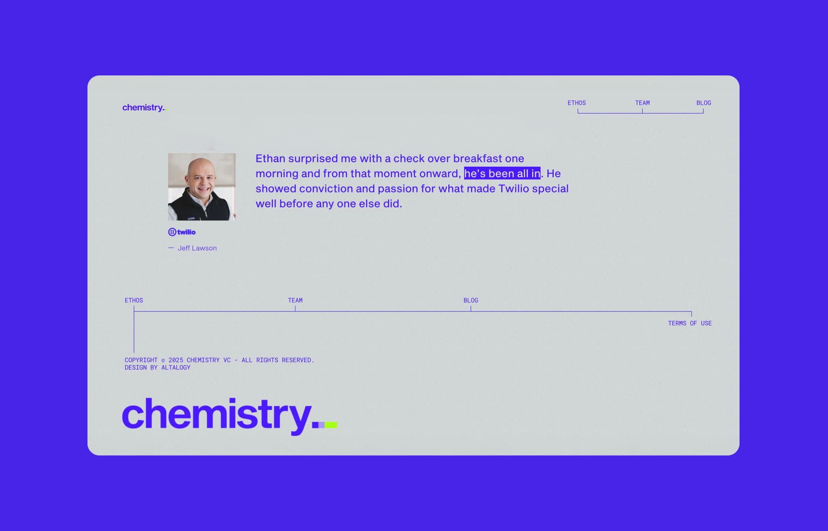
For Chemistry, it is a single, striking blue bar at the top, which frames key navigation points, and is mirrored in the footer for a balanced, memorable finish. The element feels almost scientific, with a scale-like precision that ties back to the VC's name while symbolizing connection—reinforcing their core thesis of building meaningful links.

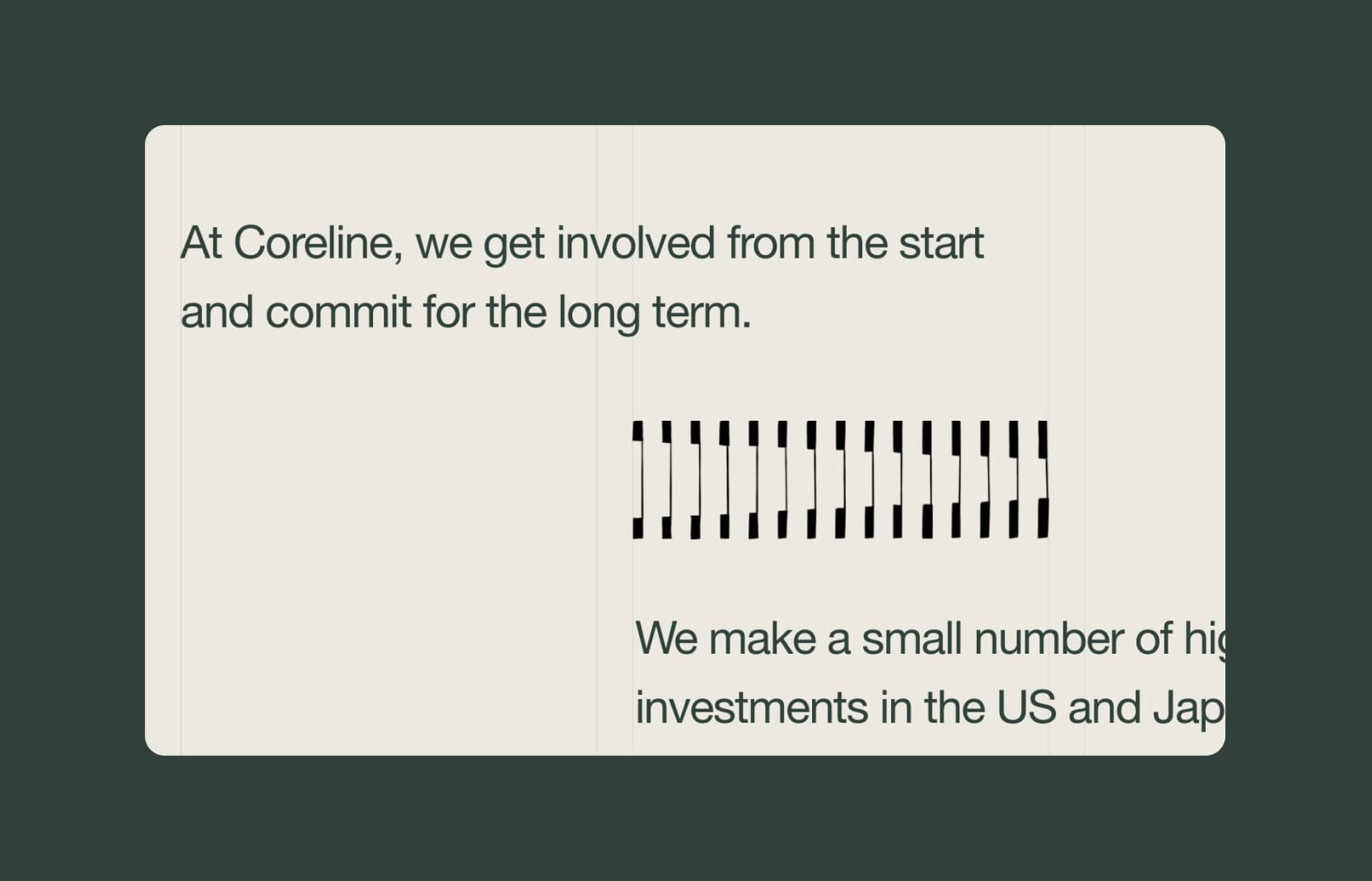
Coreline's precise grid alignment ensures text and graphic elements snap perfectly into place, reinforcing the concept of a strong, structural "core." It also nods to the architectural roots of the fund's GPs, who have highlighted that while drawing a straight line may seem simple, it demands precision and a skilled hand—reflecting their commitment to craftsmanship.

These small but deliberate breaks in uniformity introduce just enough friction to turn simplicity into memorability. They are visual cues that catch the eye and add a touch of boldness without overpowering the form.
Thoughtful accents—not complexity—are what make a brand identity.
Last edited on Jan 16, 2025 by